Card Template
One template, every card. Set your layout and branding here and every published card in the organization re-renders to match.
Overview
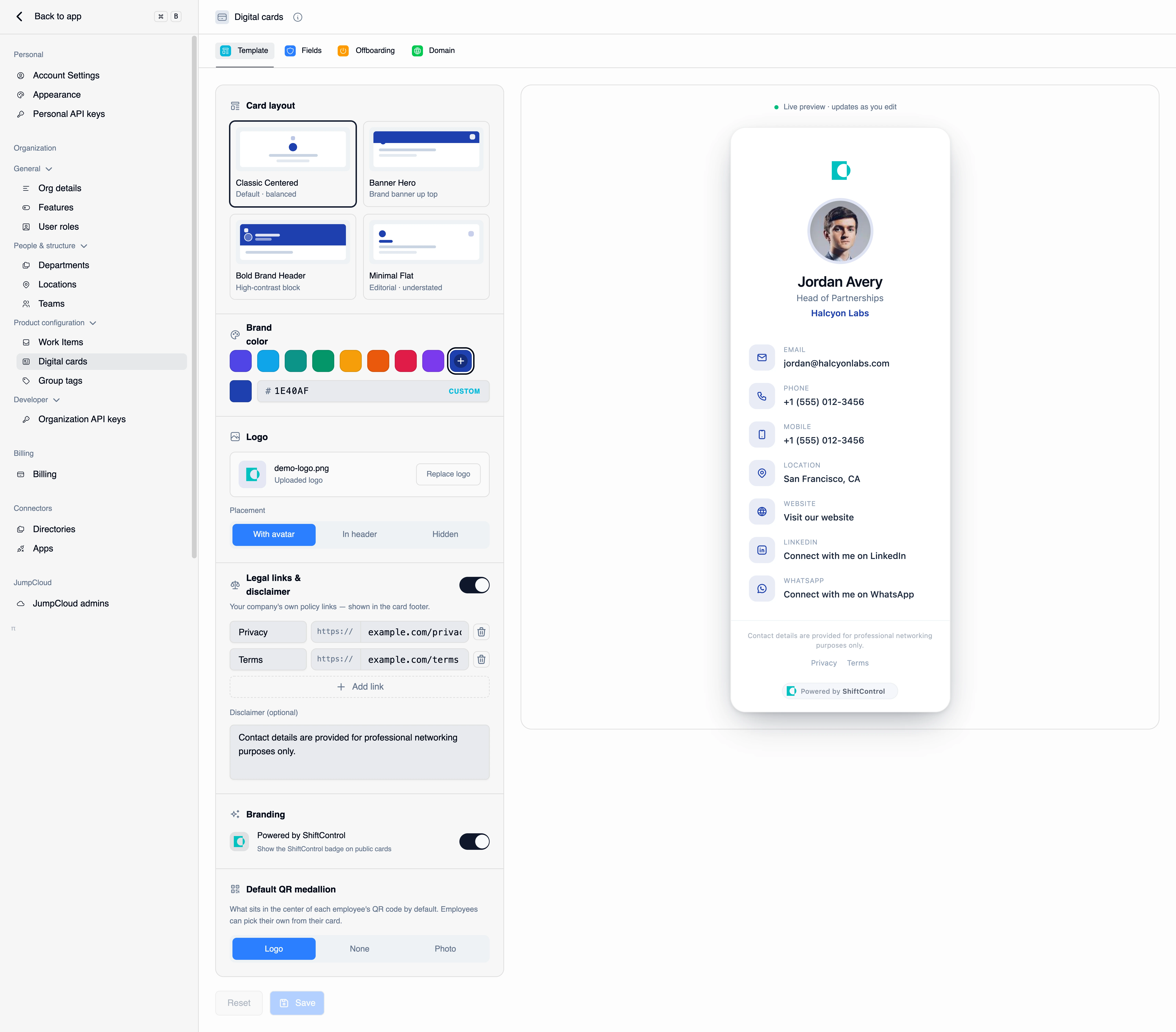
The Template tab is where your cards get their look. It's deliberately not a freeform design tool — you choose from four curated layouts and supply your brand color, logo, and legal links. That constraint is the point: it keeps every card in the organization visually consistent without you reviewing anyone's individual card.
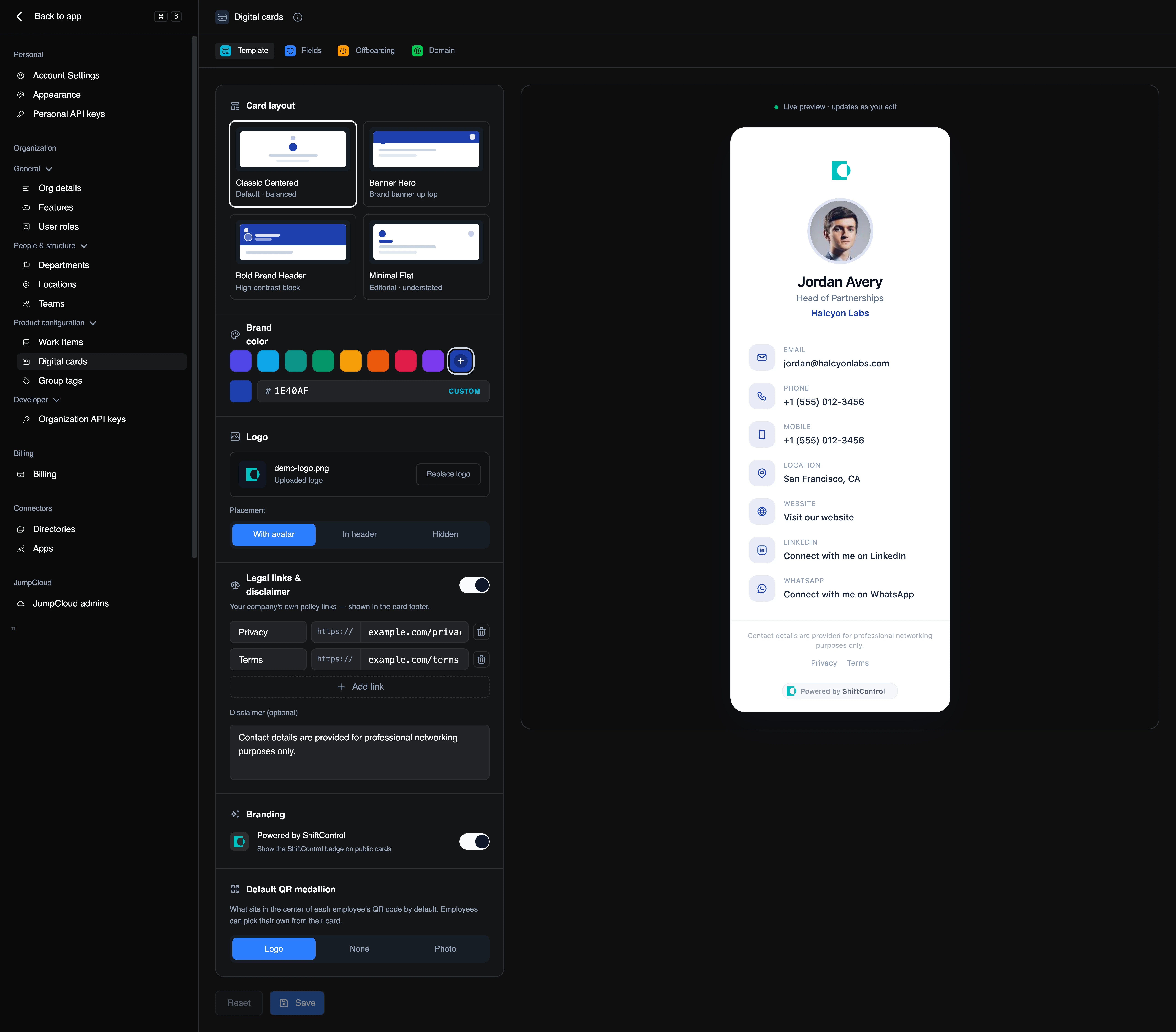
Find it under Settings → Digital cards → Template. A live preview sits beside the controls and updates as you edit, so you can see the real card before you save.
How It Works
Changes are staged locally while you edit — the preview reflects them immediately, but nothing reaches your employees' cards until you press Save. Reset discards your unsaved edits and returns to the saved template.
When you do save, the change propagates to every published card in the organization. There's no per-card republish step and no reissued links: the same URL and the same QR code now render the new design. This is what makes a rebrand a two-minute job rather than a reissue project.
Because the design is resolved at serve time, QR codes on lanyards, business cards, and email signatures keep working after a template change. Only the appearance changes.
Card Layout
Four layouts, all built to read well on a phone held up to someone else's camera:
| Layout | Character |
|---|---|
| Classic Centered | The default. Balanced, centered photo and details — closest to what people expect from a digital card. |
| Banner Hero | A brand banner across the top, with details below. Best when your logo or brand color is the thing you want noticed. |
| Bold Brand Header | A high-contrast brand block at the top with the photo and name inset. The most assertive of the four. |
| Minimal Flat | Editorial and understated. Least brand-forward; good for firms where restraint is the brand. |
Pick one and watch the preview — the differences are easier to see than to describe.
Brand Color
Choose from the swatch row or click the + to enter a specific hex value. This colour drives accents across the card: the department line, the contact-row icons, and the primary action button.
Use your actual brand hex rather than an approximate swatch. The field accepts standard six-digit hex.
Logo
Upload your organization's logo, then choose where it sits:
- With avatar — the logo appears near the employee's photo. The default, and the most balanced choice.
- In header — the logo anchors the top of the card. Pairs naturally with Banner Hero and Bold Brand Header.
- Hidden — no logo on the card. Use this when the card is meant to read as personal rather than corporate.
Replace the logo at any time; like everything else here, the change reaches published cards on save.
A logo with a transparent background can disappear against a dark brand color, and one with a baked-in white box can look like a sticker. Look at the live preview with your actual brand color set before saving.
Legal Links and Disclaimer
Turn this on to put your own policy links in the card footer — typically Privacy and Terms, though the label is yours to set. Each row is a label plus a URL; Add link adds another.
The Disclaimer field below is free text shown above the links. It's the right place for a line like "Contact details are provided for professional networking purposes only." If your legal or privacy team has an opinion about publishing staff contact details on a public page, this is where that opinion goes.
Branding
Powered by ShiftControl controls whether the ShiftControl badge appears in the footer of your public cards. On higher tiers you can turn it off to ship unbranded cards; on the Starter tier the switch is locked on and shows a Starter chip.
Default QR Medallion
The medallion is what sits in the middle of the QR code. This setting picks the organization's default:
- Logo — your company logo in the centre of the code.
- None — a plain code with no centre graphic.
- Photo — the employee's own photo.
This is a starting point, not a rule. Each employee can pick their own medallion on the My QR code tab of their card — including a custom image — and their choice wins over this default.
Common Scenarios
Scenario: Standing up the template for the first time
You're switching the org on. Leave the layout on Classic Centered, set your brand hex, upload your logo with With avatar placement, add your Privacy and Terms URLs, and paste in the networking-purposes disclaimer your legal team asked for. Save. Every card activated from now on renders in your branding without anyone else making a design decision.
Scenario: Rebranding mid-year
The company changes its primary colour and logo. You update the brand color and replace the logo here, then save. Every published card — including the ones on printed lanyards from last quarter's conference — renders in the new brand the next time it's opened. Nothing to reissue.
Things to Know
- Save is required. Edits are staged locally; the preview updates before you save, your employees' cards don't.
- The preview uses sample values. It shows representative details so you can judge the design, not a specific person's real card.
- The template is organization-wide. There's no per-department or per-region variant.
- View-only admins see this page read-only. Without Manage card settings, the controls render disabled.
Related Features
- Digital cards overview — how the whole feature fits together.
- Card fields — decide what appears on the card, not just how it looks.
- Card domain — serve cards from your own hostname.